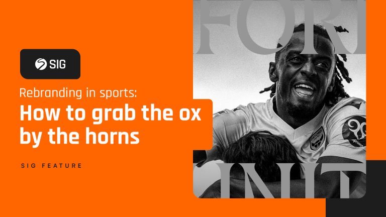


Jump Design Sig’s New Look
Sport Industry Group has undergone a significant rebrand in the past few months, with the launch of the new website and The Daily signalling the final piece of the jigsaw.
SIG partner and Sport Industry Awards official graphics provider Jump was enlisted to create our new look, so we caught up with Senior Designer Callum O’Reilly to explore the creative process behind the new design.
THE LOGO
Sport Industry Group are often referred to by their acronym SIG, and they wanted a new logo that reflected that familiarity. The redesign is a nod to the original, but a step forward into the exciting new development of SIG.
The SIG roundel is instantly recognisable, so we didn’t want to change it too much. For the brand refresh, we re-drew the S within the circle to achieve a more elegant and bolder icon, tightening up the curves and simplifying it.

The new design works on smaller applications as well because the S itself has been increased in size. The thicker lines and simplified curves mean no information gets lost when scaled down.
THE FONT
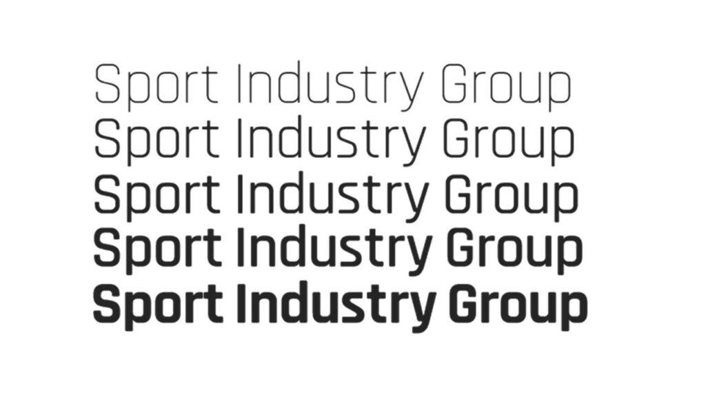
Inspired by blocky sport fonts often found on playing shirts, we chose a modern, rounded font available in many weights for the SIG typography.
THE SUB BRANDS

As well as the master SIG logo, we were also tasked with creating a coherent look for the rest of their sub-brands, such as Sport Industry Socials and Sport Industry Next Gen. Each logo has its own unique colour and typographic quirk that symbolises what that brand is all about.
For example, Sport Industry Socials includes three dots in the ‘O’ represent connection and digital chat, whereas for Sport Industry Dining we included a knife and fork.
Sport Industry NextGen, incorporates a subtle arrow symbolising the push and drive the programme gives to individuals.
The logo for the Sport Industry Daily newsletter, incorporates a mouse pointer within the A.
The roundel features in all sub-brand logos, meaning all properties are instantly recognisable as belonging to SIG.
THE COLOURS
Colour was a really important part of the design for SIG, and it gives clear distinction between each of its properties. The simple use of a background can highlight exactly which part of the business is under the spotlight and all the chosen colours work well on both the new navy blue background and on white.

Dining uses a muted red, inspired by red velvet ropes at prestigious events.
Social uses a digital green, which works well on screen and is fresh and vibrant.
Membership uses the same less saturated, redder orange as the master SIG logo