


Strava Unveils New Global Heat Map
Strava Labs has unveiled an interactive heat map which details activity for users around the world.
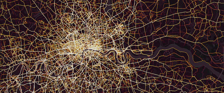
The Strava Global Heat Map is a direct visualization of Strava’s network of athletes and is six times more intricate than the original map that was released in 2015.
Strava claims that the heatmap has one billion activities, 3 trillion pixels rasterized, 10 terabytes of raw input data, a total distance of 27 billion km, a total recorded activity duration of 200,000 years, and 5% of all land on earth covered by tiles.
The map allows users to zoom in to an area and choose what to view, ride, run, water or winter activity and change the colour of the map.
Maps show the most popular areas in the UK are Manchester and London, with parks and central landmarks among the most lit areas.
Strava already has its Metro Platform, which allows users to plan routes by accessing map highlight in popular areas, but Heat Maps now also feeds into this by featuring data from cyclists, runners and swimmers.
The new feature has activities from 31 different sports, which all feeds into Strava Metro which aggregates the data into a package and works with transportation departments to improve infrastructure for both pedestrians and cyclists.
Strava CEO James Quarles said: “A global community can seem very abstract until you see its activities visually represented in your immediate location and across the world.
“It’s not just runners and cyclists, either – skiers, hikers, kiteboarders and even mountaineers on Everest are all counted in the more than 1 billion uploads of the Strava community.”