


Telegraph Builds Automated Football Graphics Tool
The Telegraph has changed its sports data-visualisation tool so interactive graphics are created and published on its website automatically each time a goal is scored.
The graphic tools were created for the Rugby World Cup 2015 to generate interactive graphics of game play. To help develop this further, Telegraph received $345,000 in funding from Google’s News Initiative and it switched to make graphics of how goals happened.
Since August, these graphics can be created and published automatically each time a goal is scored. Before this, journalists would have to wait until after the game to get specific charts produced.
The interactive graphics are inserted into the live feed on the Telegraph one minute after the goal has been registered. During the weekend of 20th – 21st August, 22 goals were auto published over ten games and automatically posted to the Telegraph Twitter account, where a graphic obtained 790 retweets, compared to the normal 80, and Facebook Messenger.
Opta provide the data, which measures who touches the ball from where on the pitch. Over the next two months, there are plans to create six more rules that will automatically generate and publish a graphic based on, besides scoring goals.
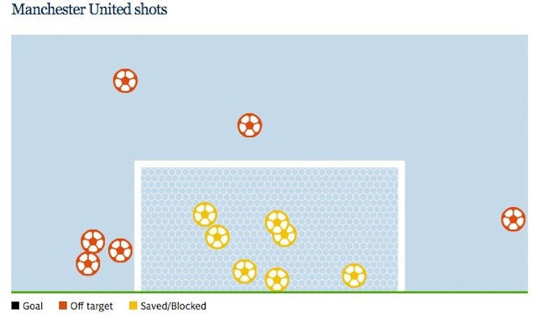
One rule that the Telegraph is considering is if a team has more than 70% possession of the ball and has made five shots at goal but scored none, it will trigger a graphic of goal attempts and whether they hit the target (such as below).
Malcolm Coles, director of digital media, Telegraph Media Group said: “We were trying to solve two problems: how to produce sports visualisations in real-time, and how to automate and save time.
“For this we needed to set up a rules engine to analyze data without the journalist even realizing that the story had happened.
“For big games you’ll always want a journalist to give the real flavor of what’s happening, give longer-term perspectives, and describe the atmosphere and the pressure on the managers. That sort of stuff isn’t in the data.”